A theme toggler is a necessity nowadays for any modern website. We will create a dark and light theme toggler in React using context API.
We will be using React context for this, to know more about React context check out the official documentation here – Context – React (reactjs.org)
Firstly we are going to set up our project, I am using vite to do so, you can also do that using create-react-app if you prefer so.
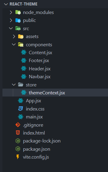
Once the project is set up, we are going to create a folder called store, inside which we are going to create our context file, let’s name it themeContext.jsx
The folder structure will look something like this –
Let’s start with creating a context, inside the themeContext.jsx file insert the following code –
import { createContext, useEffect, useState } from "react";
//createContext will let us create a context to be used in the app

const ThemeContext = createContext({
  isDark: false, //state that will indicate if the theme is dark or not
  themeToggle: () => {}, //function to toggle between light and dark theme
});

export default ThemeContext;
Now we will create a function that will provide context to the components/app –
export const ThemeContextProvider = (props) => {
  const [isDark, setIsDark] = useState();

  const themeToggler = () => {};

  return (
    <ThemeContext.Provider>
      {props.children}
    </ThemeContext.Provider>
  );
};
<ThemeContext.Provider> will receive a prop called value which will be an object consisting of isDark state and themeToggle function.
Now let’s setup the initial value for the isDark state –
const isDarkInitially = () => {
  if (localStorage.theme === "dark") return true;
  return false;
}; //this will return true if theme in localstorage is set to dark else will return false
we will utilize useEffect hook to set an initial theme value and update the isDark state every time it is toggled.
useEffect(() => {
    if (isDark) localStorage.theme = "dark";
    else localStorage.theme = "light";
  }, [isDark]);
Finally the themeContext.jsx will look something like this –
import { createContext, useEffect, useState } from "react";
//createContext will let us create a context to be used in the app


const isDarkInitially = () => {
  if (localStorage.theme === "dark") return true;
  return false;
};

const ThemeContext = createContext({
  isDark: false, //state that will indicate if the theme is dark or not
  themeToggle: () => {}, //function to toggle between light and dark theme
});

export const ThemeContextProvider = (props) => {
  const [isDark, setIsDark] = useState(isDarkInitially);

  const themeToggler = () => {
    setIsDark((val) => !val);
  };

  useEffect(() => {
    if (isDark) localStorage.theme = "dark";
    else localStorage.theme = "light";
  }, [isDark]);

  return (
    <ThemeContext.Provider
      value={{
        isDark,
        themeToggle: themeToggler,
      }}
    >
      {props.children}
    </ThemeContext.Provider>
  );
};

export default ThemeContext;
Let’s provide the context to the app –
In the file main.jsx let’s insert the following code –
import { ThemeContextProvider } from "./store/themeContext";

ReactDOM.createRoot(document.getElementById("root")).render(
    <ThemeContextProvider>
      <App />
    </ThemeContextProvider>
);
Now the complete app is wrapped in the theme context and the context can be used anywhere in the app
We will be toggling the class dark on the main container of the app so that style can be toggled for the complete app, in the app.jsx file –
import { useContext } from "react"; //use context hook will let us use the context
import ThemeContext from "./store/themeContext";

import Content from "./components/Content";
import Footer from "./components/Footer";
import Header from "./components/Header";
import Navbar from "./components/Navbar";

const App = () => {
  const themeCtx = useContext(ThemeContext);

  const darkClass = themeCtx.isDark ? "dark" : "";

  return (
    <div className={`app ${darkClass}`}>
      <Navbar />
      <Header />
      <Content />
      <Footer />
    </div>
  );
};

export default App;
Theme setup is all complete, the only thing remaining is the button or toggler to switch between themes. We will set up the button in the Navbar component. In the Navbar.jsx file –
import { useContext } from "react";
import ThemeContext from "../store/themeContext";

const Navbar = () => {
  const themeCtx = useContext(ThemeContext);

  return (
    <nav className="bg-light shadow py-4">
      <div className="container flex items-center justify-between">
        <h3>
          <a href="#">Logo</a>
        </h3>
        <ul className="flex items-center gap-2">
          <li>
            <a href="#">Home</a>
          </li>
          <li>
            <a href="#">Portfolio</a>
          </li>
          <li>
            <a href="#">Contact us</a>
          </li>
          <li>
            <button onClick={themeCtx.themeToggle} className="btn" href="#">
              Toggle theme
            </button>
          </li>
        </ul>
      </div>
    </nav>
  );
};

export default Navbar;
That’s all!
Now you have a working theme toggler. Get the full code here – https://github.com/ShubhDobriyal/react-context-theme-toggler
Happy Coding 😉


Great sir Amazing Blog .
your step by step explanation make it so easy
Your step by step explanation make it very easy sir
Your step by step explanation make it very easy sir
Really very helpful. It is Appreciable! 👍🏻